
The Kindle editions of IDITAROD and STIEG LARSSON Man, Myth & Mistress have come in for a good deal of favorable comment for the excellence of their typography. That is no accident. I spent weeks developing those templates. Unfortunately, those proven templates won't translate directly to a paperback design, so I had to start from scratch.
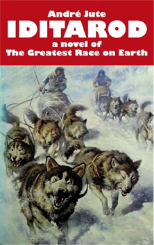
Originally there was no intention of publishing a paberback or indeed any printed edition, but it turned out that there was a substantial demand for paperback copies of IDITAROD. Since the customer is always right...
Print on demand will be executed by Amazon's Createspace operation. Their smallest size, 5 by 8 inches, is larger than a standard mass market paperback, but I don't mind, as the larger format will permit me to choose a larger typesize. I'm working in QuarkXPress, still the most powerful layout program available, regardless of the whining of johnnycomelatelies about the admittedly steep learning curve. Of course, when I did the setup, there was no text to start with, just blank space. But it is easier to explain what is happening when I show copy in the spaces in which the typographer only imagines copy.
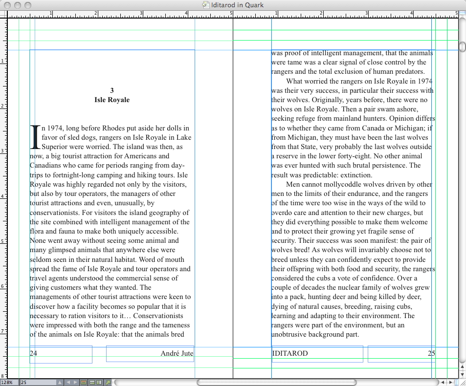
Here I've set up the margins. POD isn't a particularly precise operation, so extra large clearances are required on the inside (the edges of the pages nearest the binding). That means that on the outside one sets text nearer the edge than is truly desirable. Note the extra guideline through the outer edge of the text. That's where I would like to design to, but cannot because the inside margin is such a space hog that the line becomes shorter than reads comfortably.
I decided on a ragged right edge to the text before I started design. That is what I designed for the Kindle edition, and the detail will tie the two editions together. Furthermore, I'm keen to use a typesize large enough even for older eyes to read comfortably, but with a justified text block that is a recipe for rivers of white space through every page. So, to have the large text and good letter and word spacing, the ragged right is essential.
Here I've decided on the typesize and leading, 12 on 15 point. I always knew that this novel would be set in Times New Roman; nothing else was considered. IDITAROD is a novel for all the family from 12 to 94, set in Alaska, with a substantial market in Alaska and Canada and other icy places with long winters, and perhaps to be read in places where the light isn't wonderful. The designer ego-tripping with fancy fonts and obtrusive design will not be appreciated!
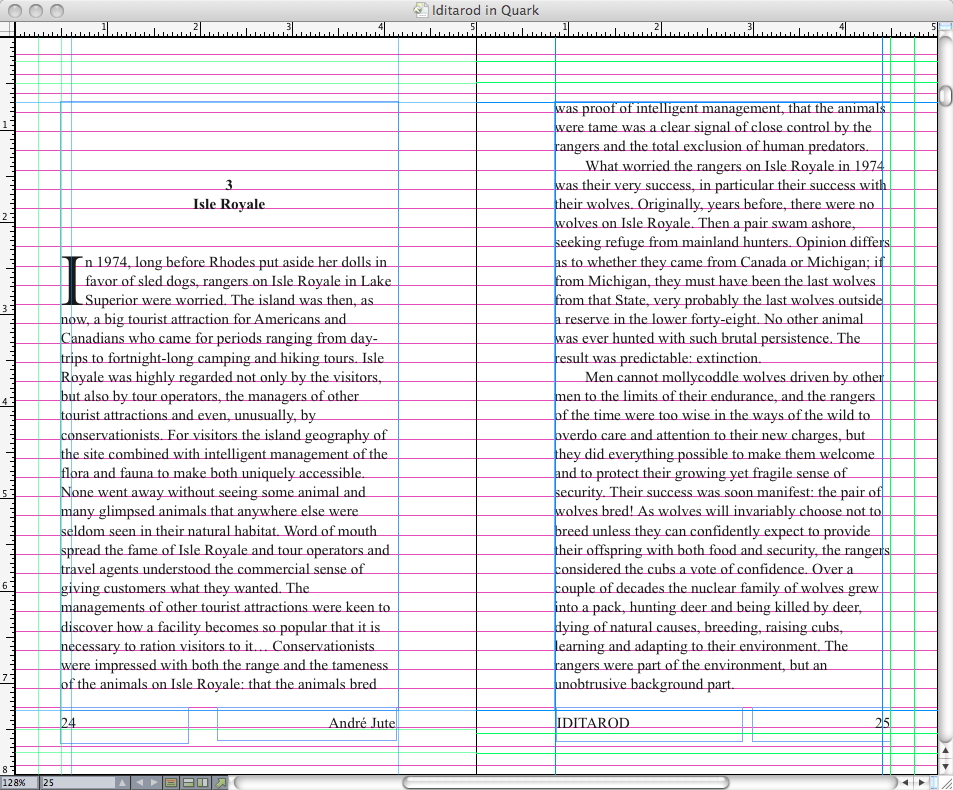
Here are all the grids. Notice that both running titles and page numbers are at the bottom of the page. Once more, the designer who hankers after large, readable typesize, knows in advance that it will put white space at a premium. He will have to squeeze in an extra line or two per page if the book is not to become inordinately thick. One of the extra lines of body copy I squeezed in sits in the space the page number would otherwise occupy.
And here we are, the page of text, with some precious white space distributed to the chapter head. The proportions are acceptably near the golden mean. I could perhaps get closer to the golden mean with the next standard size up, 5.5 by 8.5 inches but that's very big for a pocketbook.
17 Days Later
So, is that a wonderful design, or is it a wonderful design? Well, actually, there's something niggling wrong with it. Not the big risk, not the right rag; that works well for me. Nor the tall face on the type. Something small and irritating.
I started out wanting a pocketbook and easy-reading print, and the two desires are incompatible. Amazon's Createspace just doesn't offer a proper pocketbook size. The thing about the larger sizes is that they need some white space to work, and that's before the requirements imposed by a 12 point font's width and reading-line length.
After all that work, I was not satisfied. I kept coming back to this, and eventually spent another two and a half days on this single interior design, trying out various combinations and permutations, with which I shan't bother you, because none of them were as good as what I already achieved. It wasn't a different font I wanted, or to scale it down to 11.5pts, but a smidgin more white space.
So, in the end, I just gave up choosing the smallest Createspace standard size — which isn't a pocketbook anyway! — and added the quarter-inch of white space necessary aesthetically to match the rest of the elements by going a size up to 5.25x8 inches. It makes so much of an improvement!


First the 5in wide page, then the 5.25in wide page. Can you feel how much more satisfaction that extra sliver of white space delivers? Now my head rests! (Yadayadayada from accountants. That's why they're accountants, to go yadayadayada.)
A new edition of André Jute's bestselling standard textbook, GRIDS, THE STRUCTURE OF GRAPHIC DESIGN comes out later this year.