The cover for the paperback version of IDITAROD has a number of fixed elements. The size is fixed by the interior design and the number of pages. The Gino d'Achille illustration is fixed by reader demand and a desire to keep a family resemblance to the electronic editions, the typography ditto. The back cover blurb is fixed by success over the years.
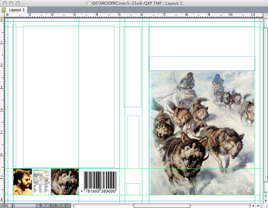
Here I've laid down the grid, including bleeds, and inserted a few elements. The illustration is the wrong shape to bleed; too much of interest would be lost. It is essential that the map be thumbnailed on the cover but that too is an awkward shape, and the ISBN barcode is, as always, just plain ugly. I solve both problems with an illustration bar, thereby turning the bar code into an illustrative element.
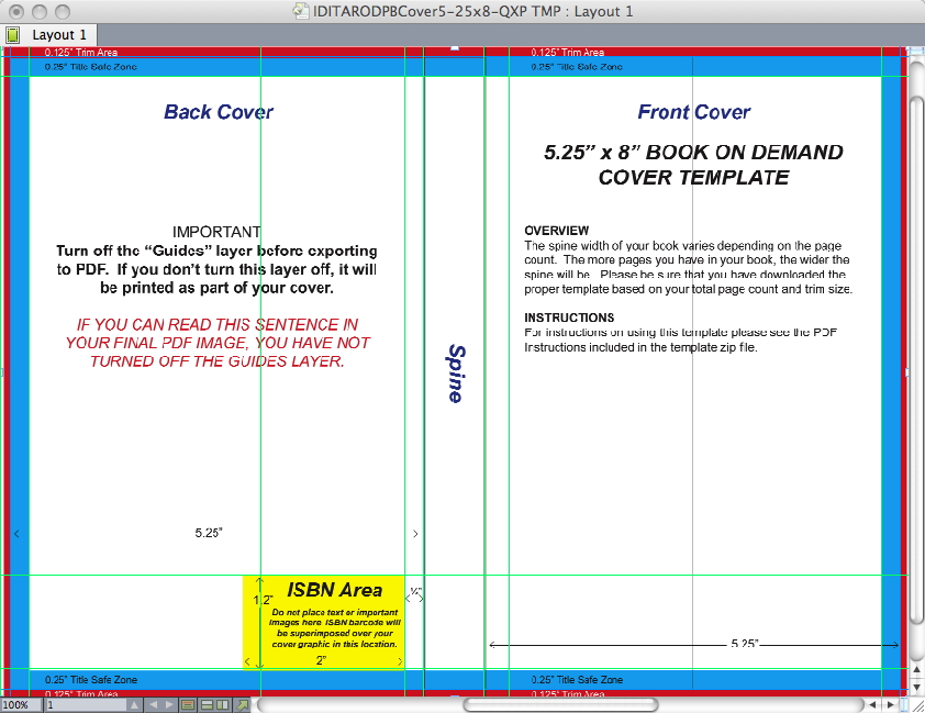
This is a template Createspace creates in return for filling in a dialogue box with the size of the trimmed book, the number of pages, paper choice, and colour specification.
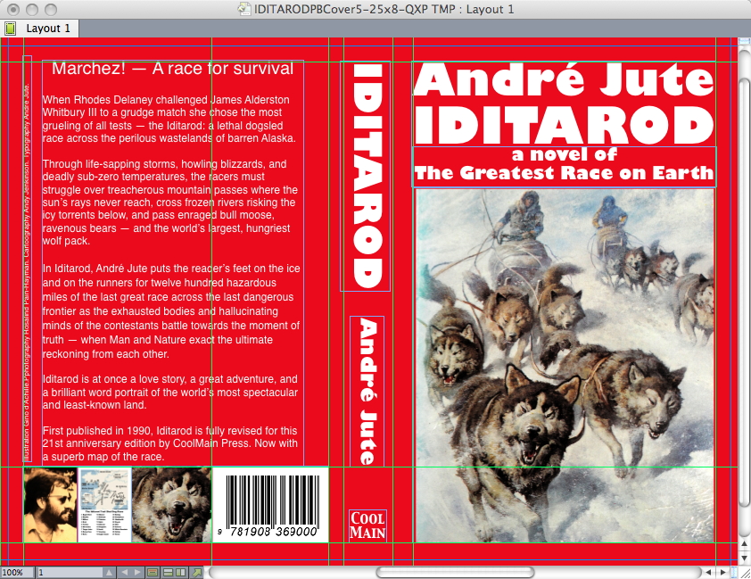
Here all the elements are in place, with a plain red background. Notice how it unifies the illustration bar on the back cover.
And the cover whole. This is a bit more modern than the 1990 paperback, without deserting any of the elements of a cover that has considerable nostalgia value for readers.
When I've lived with this cover for a few days, I'll deliver it to the printers.
A new edition of André Jute's bestselling standard textbook, GRIDS, THE STRUCTURE OF GRAPHIC DESIGN, comes out later this year.


